DEEEZ is all about bringing creativity and unique concepts with an intelligent business perspective to a wide range of design sectors.
DEEEZ specialization is graphic design and the focus is on Corporate visual identity, packaging design, web design, brand design and development, and new media. Also, we benefit from a number of capabilities in the field of brand strategy. In fact, we are a small team with the capabilities of a big agency.
COMMISSIONED BY DEEEZ.CO
Client: WWW.PEDORIFAMP.COM
PACKAGING DESIGNER:MOSTAFA S. EBRAHIMI & YEKTA JEBELLI
ART DIRECTOR & GRAPHIC DESIGNER:SEYYED MOSTAFA SEYYED EBRAHIMI
ILLUSTRATOR & CONCEPT:YEKTA JEBELLI
AR DEVELOPER:ALIREZA TABASI
MOTION DESIGNER: MOHAMMAD ARDESHIRI
WEB DESIGNER AIDA ABASI, MOSTAFA S. EBRAHIMI
LOGO DESIGN:AIDA ABASI
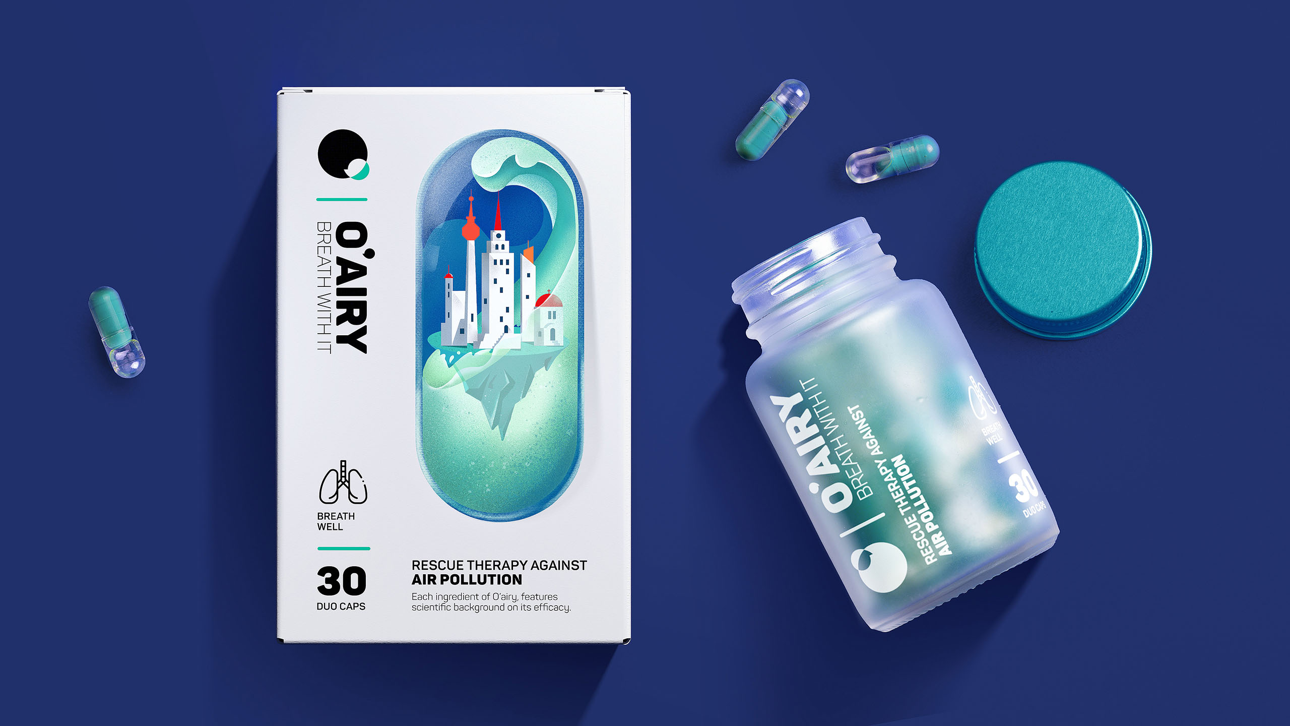
People in cities across the world such as Beijing, New York, New Delhi, Jaipur, and Tehran are all affected by air pollution. O’air is a brand that has produced the most reliable air pollution supplement formula for the first time. This supplement dramatically protects vital organs, including the lungs, brain, and heart, from the effects of air pollution. It also improves lung function, increases energy, and helps the respiratory system.
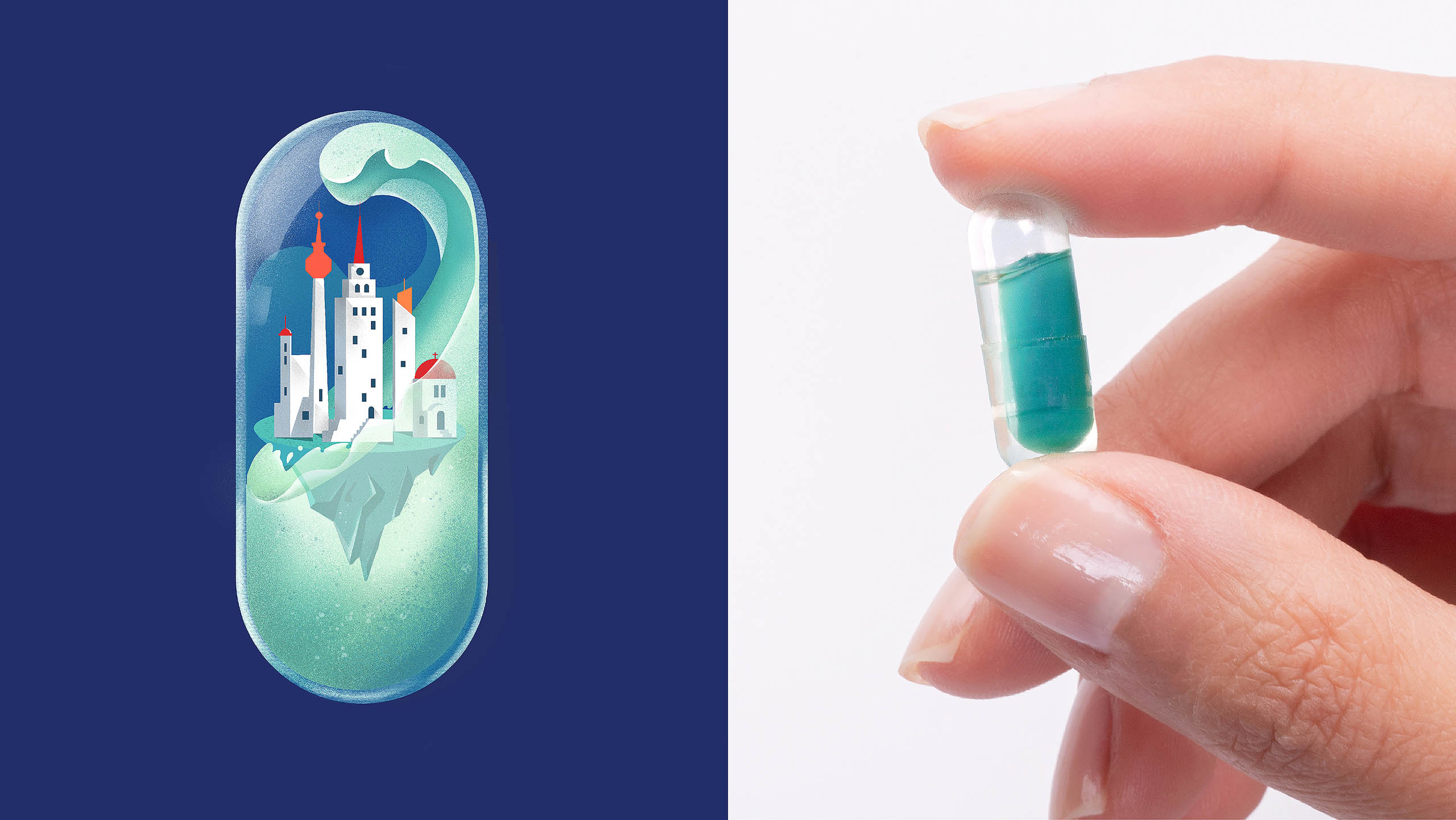
This product is in the form of capsules within capsules. The contents of the transparent outer capsule are in liquid form, and the contents of the inner capsules are in the form of white pellets. The basic idea of the packaging shape was taken from the combination of the capsule form and the high rises of crowded cities. It was eventually implemented as a city inside the capsule.
MOVE IT, MOVE IT!
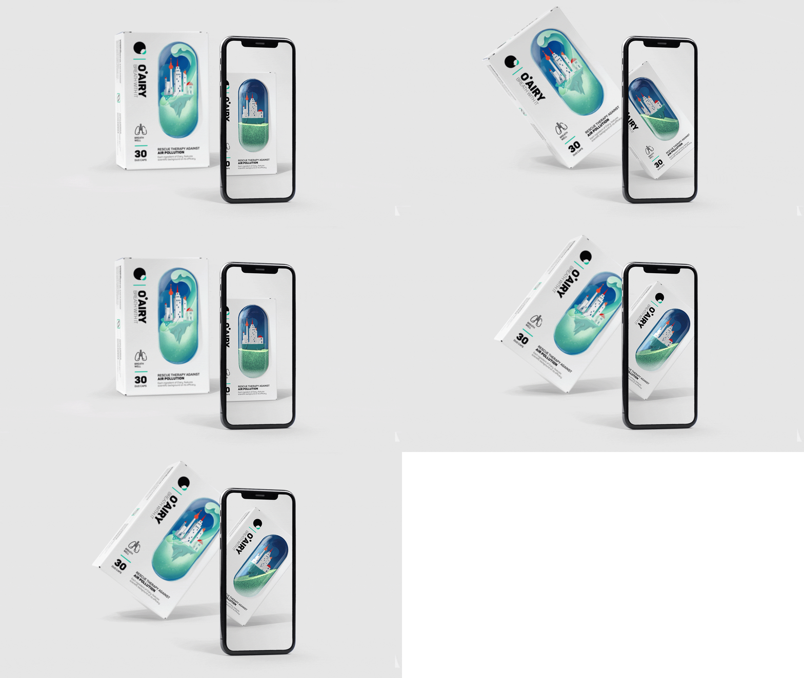
AR technology was added to this project. After scanning the QR code and installing the app, the design on the packaging can be seen in 3D form. Shaking the packaging causes the liquid inside the 3D capsules to move as well.
In other words, the special nature of this packaging is due to the special nature of the supplement. It reminds consumers of the uniqueness of the formula and the fact that it is unlike the uniform packaging of other supplements. In a way, it engages the consumer with this entertaining aspect.
Another reason for adding this feature to the packaging is to intensify the performance fo the supplement because after scanning the image and observing the shaking of the water and cleanliness of the city, a feeling will arise for the consumer which causes them to become more aware of the effects of this supplement on themselves.
The whole branding design is done by us. Here are some developed design for O’airy. The idea of illustration has been developed on website, too.