DEEEZ is all about bringing creativity and unique concepts with an intelligent business perspective to a wide range of design sectors.
DEEEZ is all about bringing creativity and unique concepts with an intelligent business perspective to a wide range of design sectors. DEEEZ specialization is graphic design and the focus is on Corporate visual identity, packaging design, web design, brand design and development, and new media. Also, we benefit from a number of capabilities in the field of brand strategy. In fact, we are a small team with the capabilities of a big agency.
Blu Bank packaging design by DEEEZ transforms card delivery into a tactile and engaging unboxing experience for a fully digital bank.
RHEYN | Rhyton Reserve
Concept by:
DEEEZ Design & Creativity ltd
Ⓒ ALL RIGHTS RESERVED.
RHEYN
Rhyton Reserve
DIELINE AWARDS WINNER 2021
THIRD PLACE
Presented by Adobe
Ancient Ritual. Contemporary Wine Packaging.
A wine brand designed to be held, experienced, and remembered.
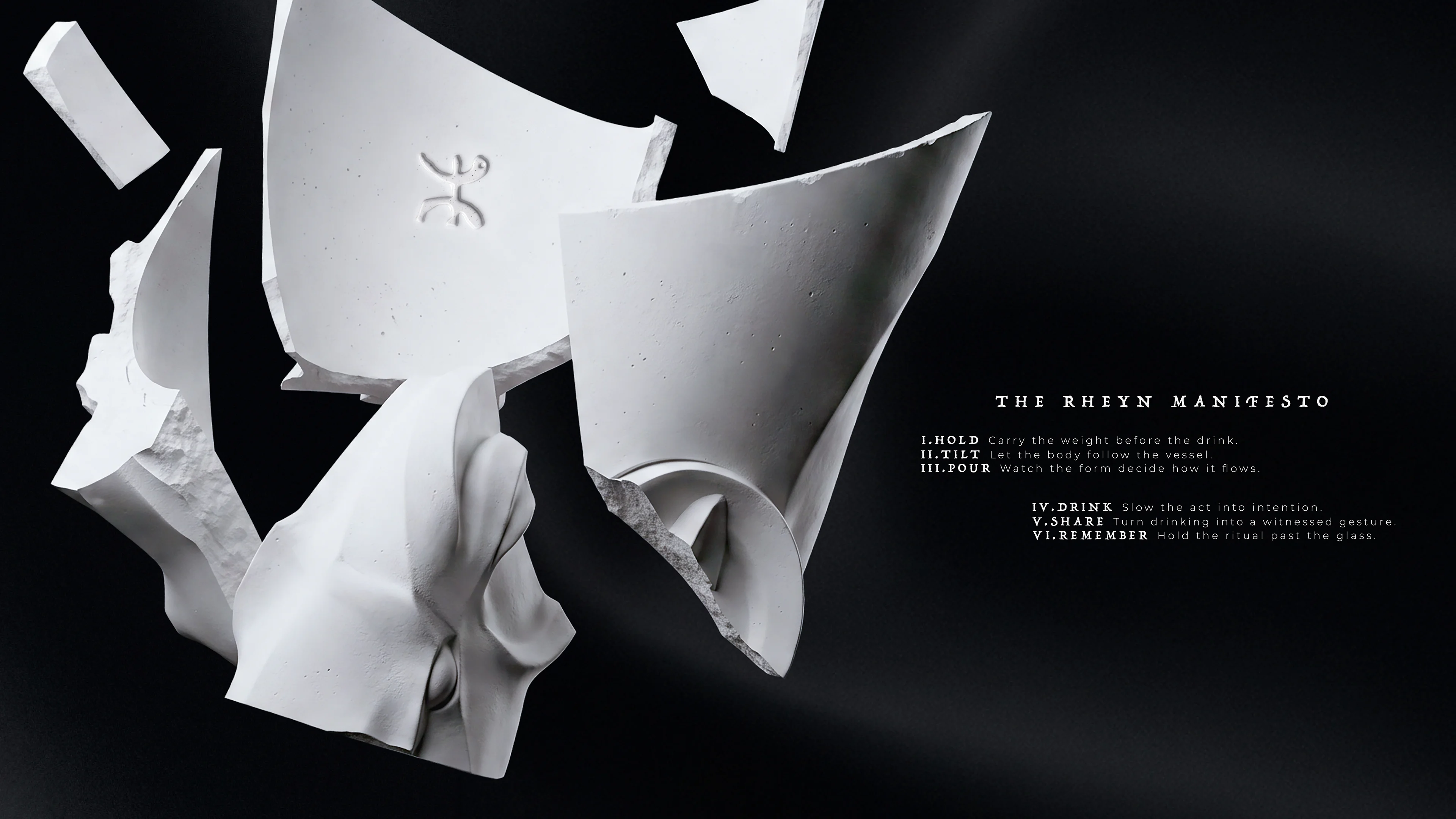
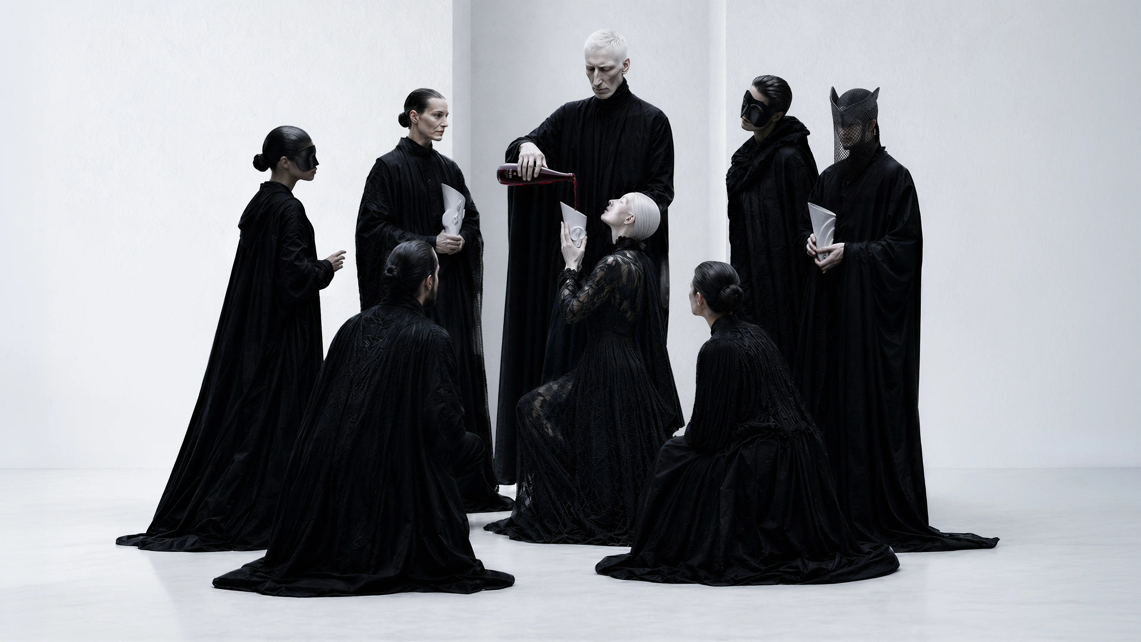
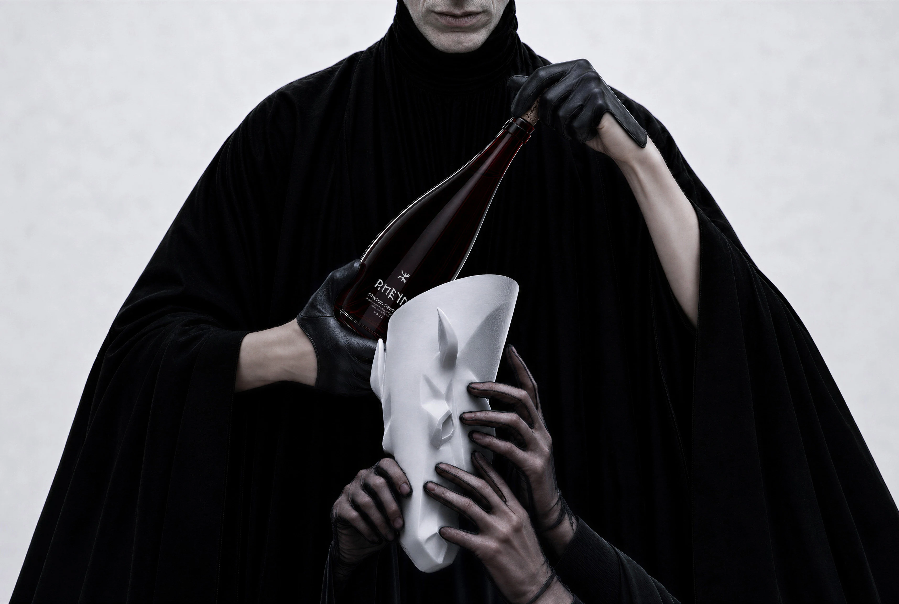
RHEYN — Rhyton Reserve is a wine branding and creative packaging design project by DEEEZ that brings a new perspective to the red wine experience. Inspired by the ancient Persian rhyton, a ceremonial drinking vessel associated with royal banquets, the project explores how form can influence behaviour and give a brand a distinctive presence.
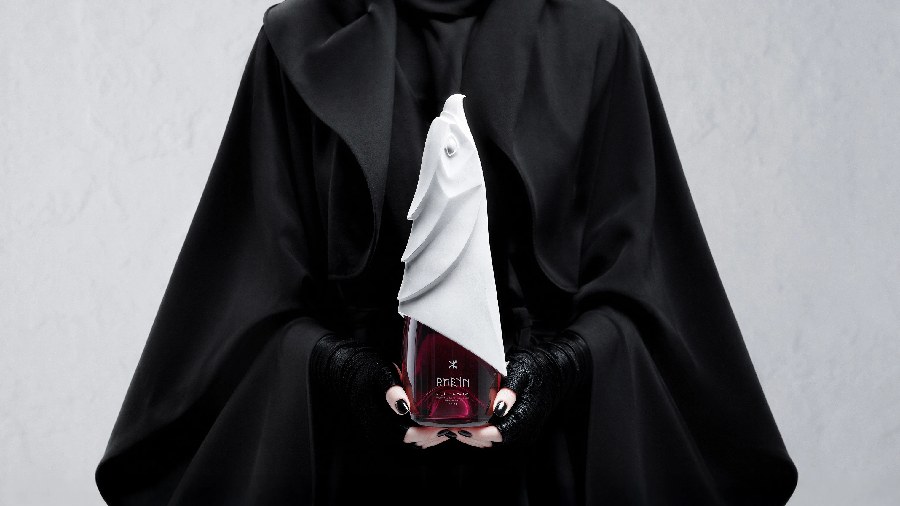
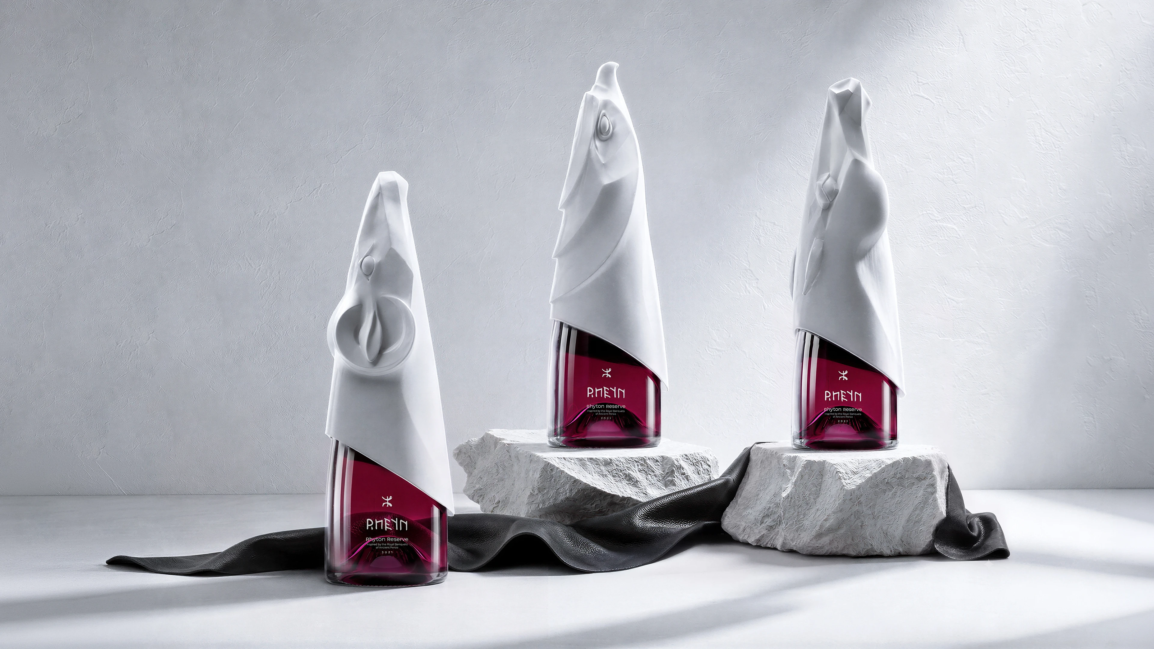
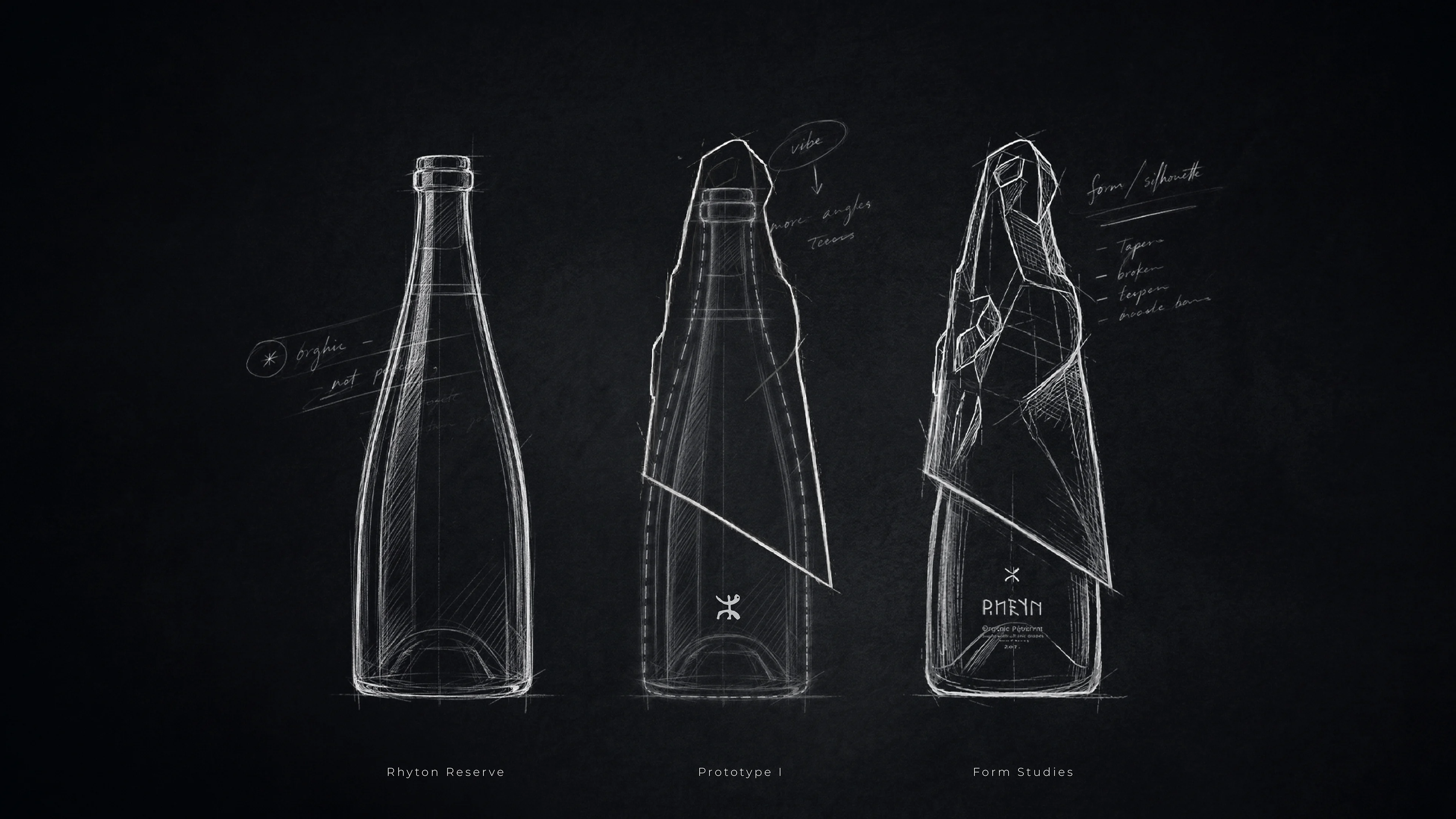
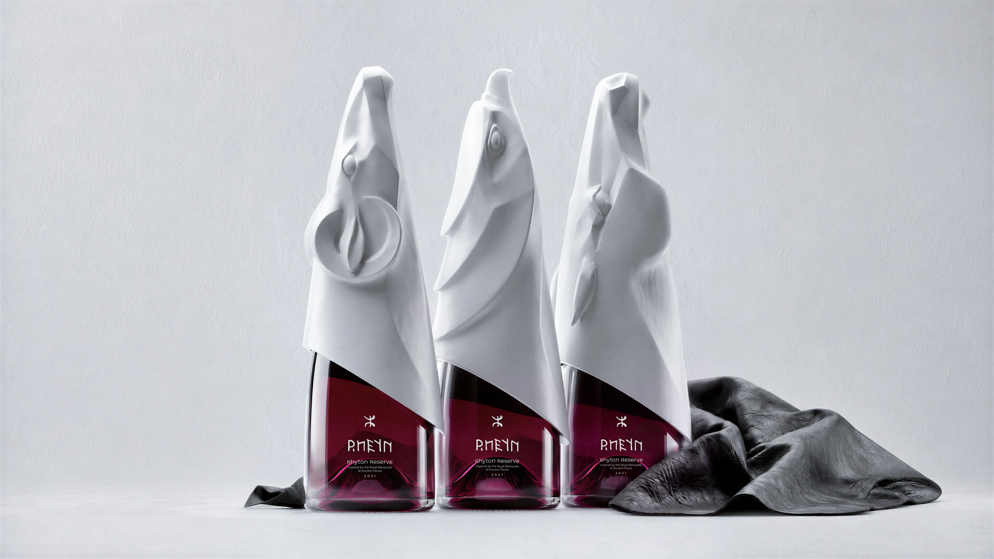
The idea begins with a simple gesture: holding. A tapered, asymmetric form resists being set down like a conventional glass, keeping the object in the hand and making the interaction more deliberate. Packaging becomes an active part of the experience, drawing attention to the relationship between the person, the vessel, and the ritual. This physical interaction also provides a foundation for differentiation in the wine market. RHEYN’s identity begins with the shape of the object itself, giving the brand a visual signature that extends beyond its graphics. Its sculptural profile is designed to become a focal point in product displays, exhibitions, and campaign imagery, inviting a closer look.
By translating an ancient ritual into contemporary wine packaging, RHEYN creates a design story that can be communicated through both the object and its presentation.
Creative Packaging. Distinctive Wine Branding.
RHEYN’s minimal, monolithic silhouette brings the ceremonial character of the rhyton into a contemporary visual language. Sculptural form, deliberate imbalance, and restrained detailing express its cultural inspiration without reproducing historical ornament.
The design considers how the object is encountered in the hand and on display. Its asymmetric outline offers a distinctive profile from different viewpoints, while its pared-back form gives photography and art direction a clear focal point. The intention is to create a recognisable presence across the places where potential customers first discover the brand.
That same thinking shapes the wider brand identity. Visual identity, tone of voice, and art direction extend the central concept, connecting the packaging with a consistent story of ritual, attention, and presence.
RHEYN offers an inspirational design direction for wine and beverage brands seeking a closer connection between cultural storytelling and product experience. It demonstrates DEEEZ’s approach to beverage branding: using creative packaging to express a clear idea, establish a distinct market position, and give people something memorable to engage with.
For brands launching a new product or reconsidering their identity, the project shows how packaging can become a defining part of the brand’s character.