DEEEZ is all about bringing creativity and unique concepts with an intelligent business perspective to a wide range of design sectors.
DEEEZ is all about bringing creativity and unique concepts with an intelligent business perspective to a wide range of design sectors. DEEEZ specialization is graphic design and the focus is on Corporate visual identity, packaging design, web design, brand design and development, and new media. Also, we benefit from a number of capabilities in the field of brand strategy. In fact, we are a small team with the capabilities of a big agency.
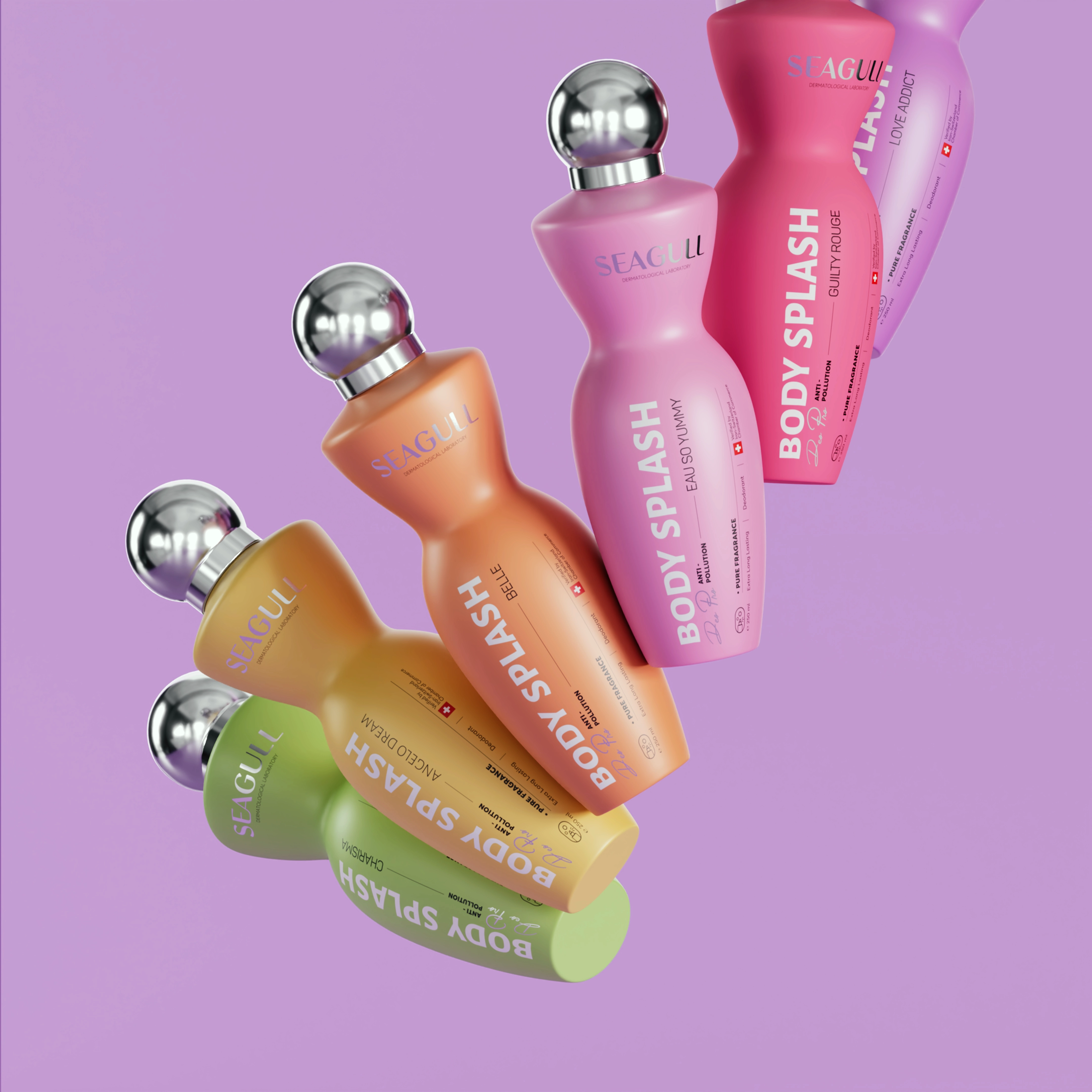
Skincare packaging design for Seagull was developed by DEEEZ as part of a complete transformation of the brand’s visual identity, packaging system, and dermatological skincare positioning.
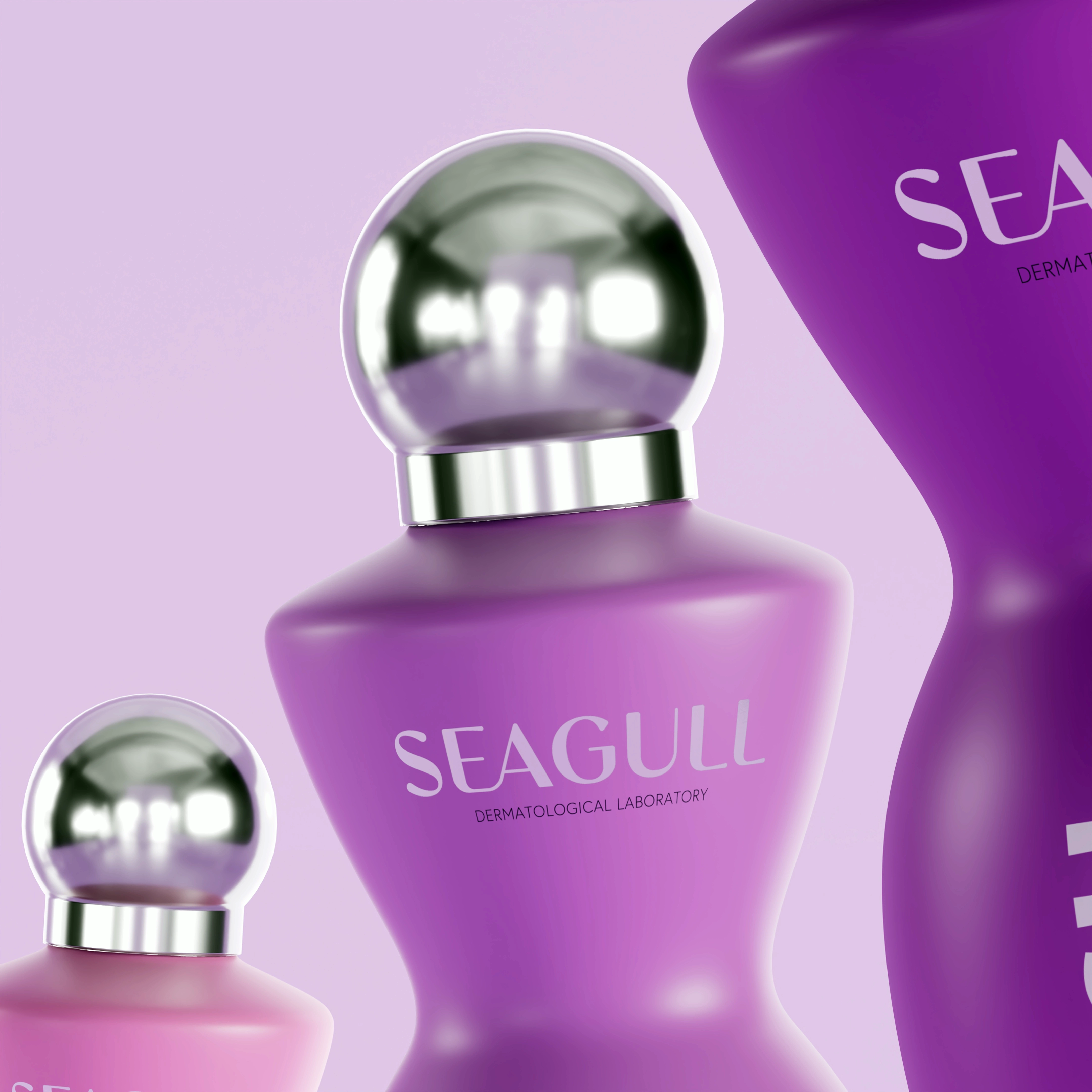
Seagull skincare packaging design and branding by DEEEZ created a clearer, more cohesive, and clinically confident identity for a heritage dermatological skincare brand. With more than five decades of pharmaceutical expertise across the MENA region and GCC markets, Seagull needed a packaging and brand identity system that better reflected its scientific foundations and modern skincare positioning.
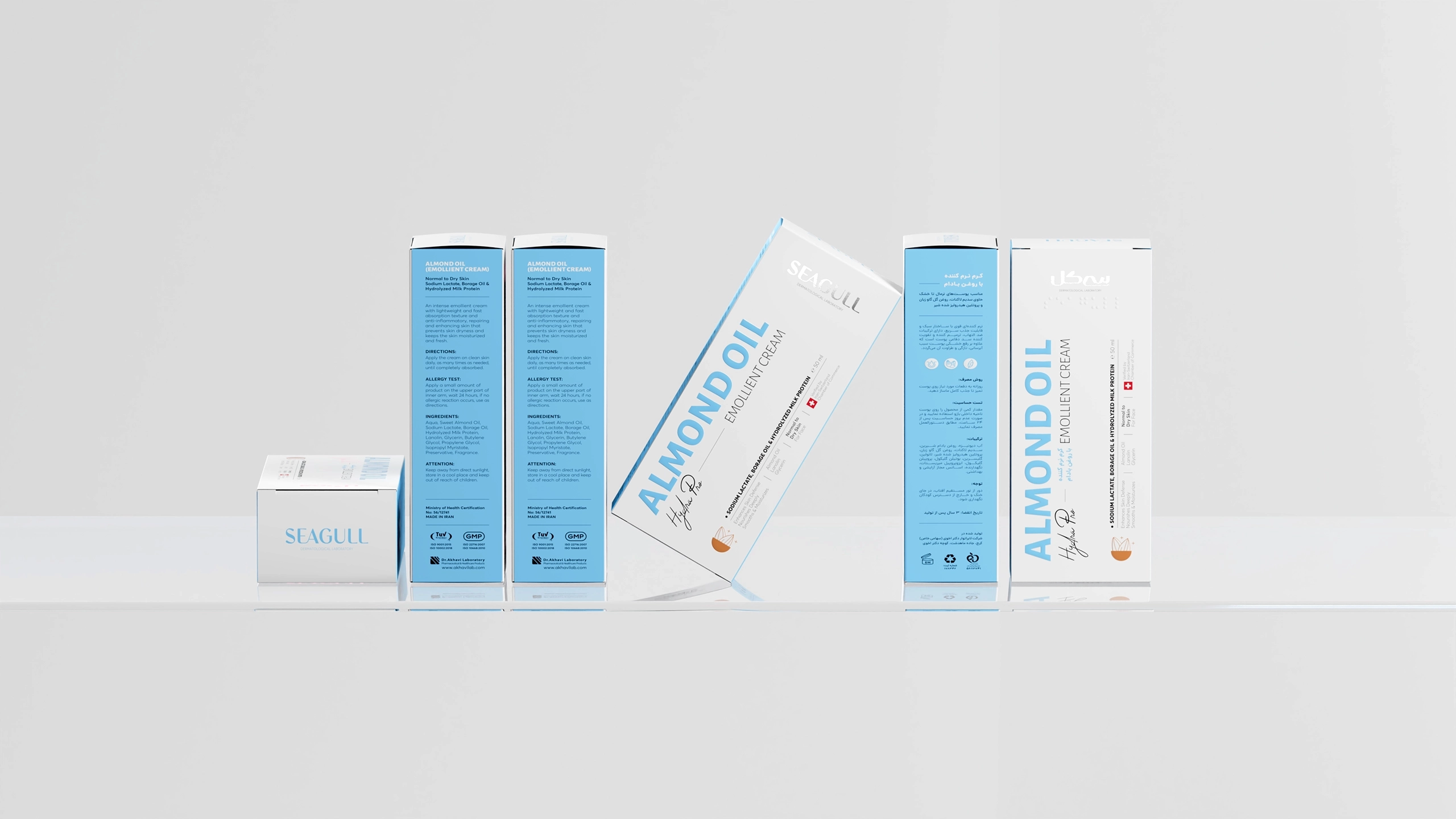
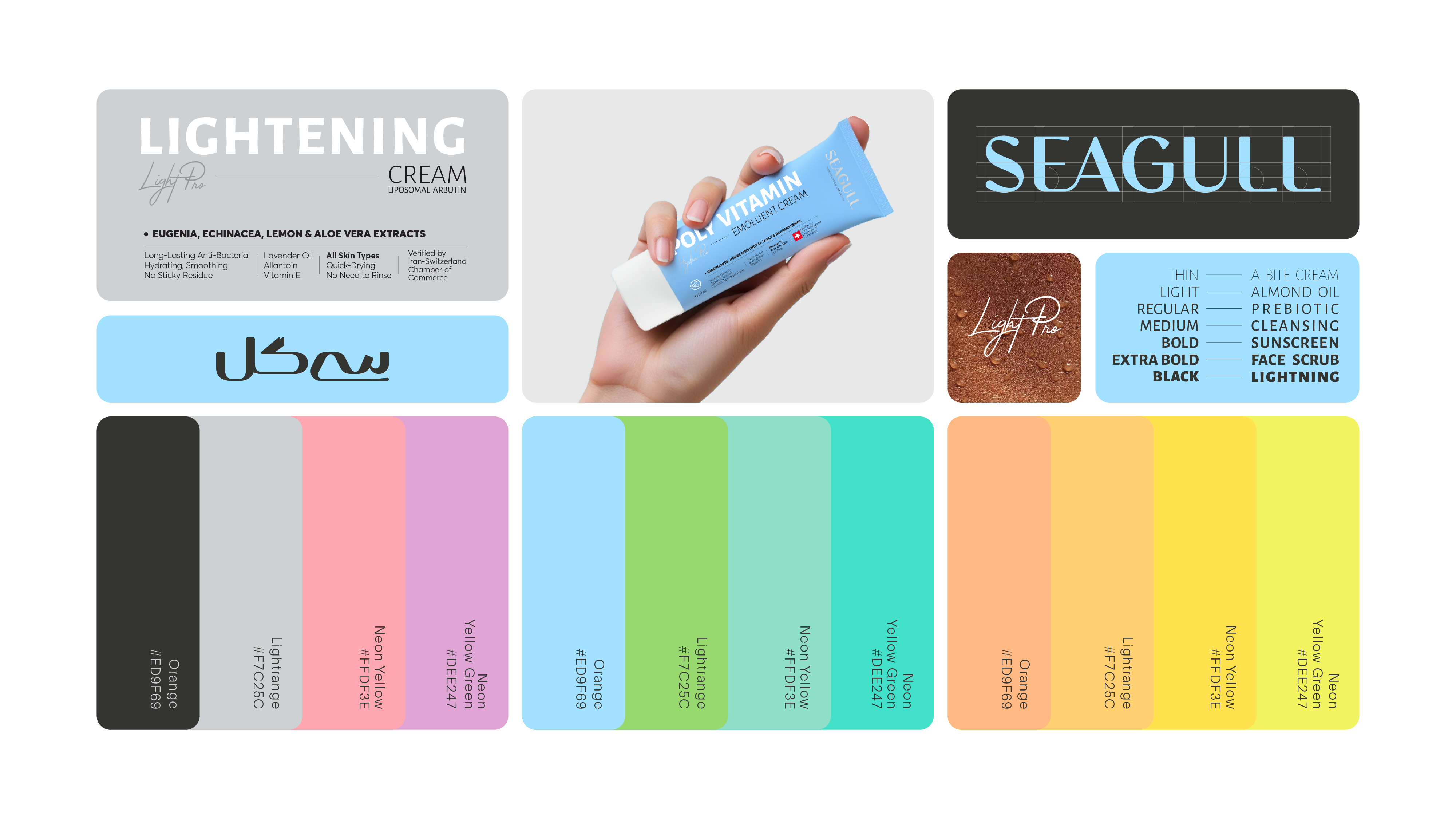
The redesign refined the brand architecture, Persian and English logotypes, product hierarchy, and visual system to improve clarity, credibility, and consumer navigation across the skincare range.
Redesigning Seagull
Seagull skincare packaging design and branding by DEEEZ redefined the brand’s visual identity, product architecture, and clinical design system. By modernising the logotypes, improving packaging hierarchy, and creating a cohesive dermatological skincare language, the redesign strengthened clarity, credibility, and consumer navigation across the full range.
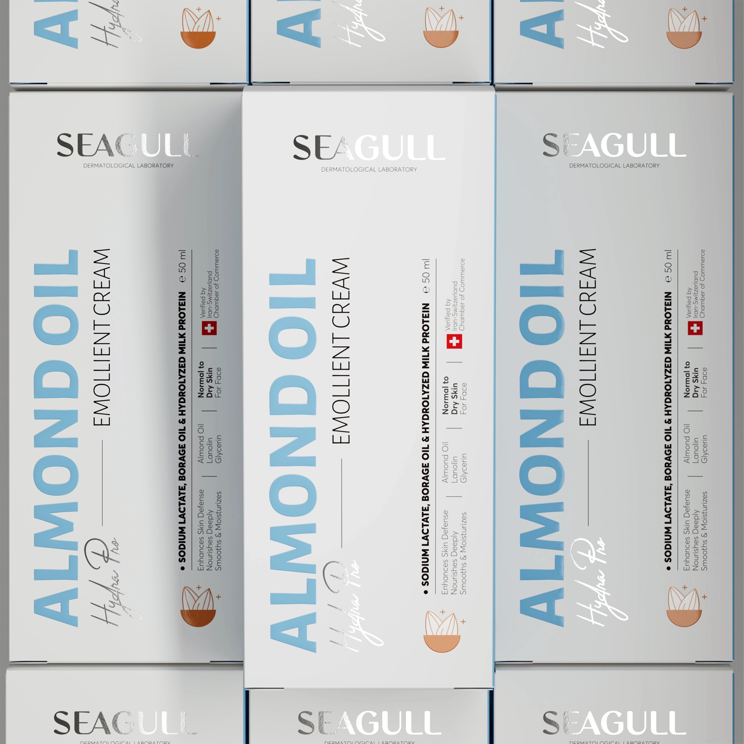
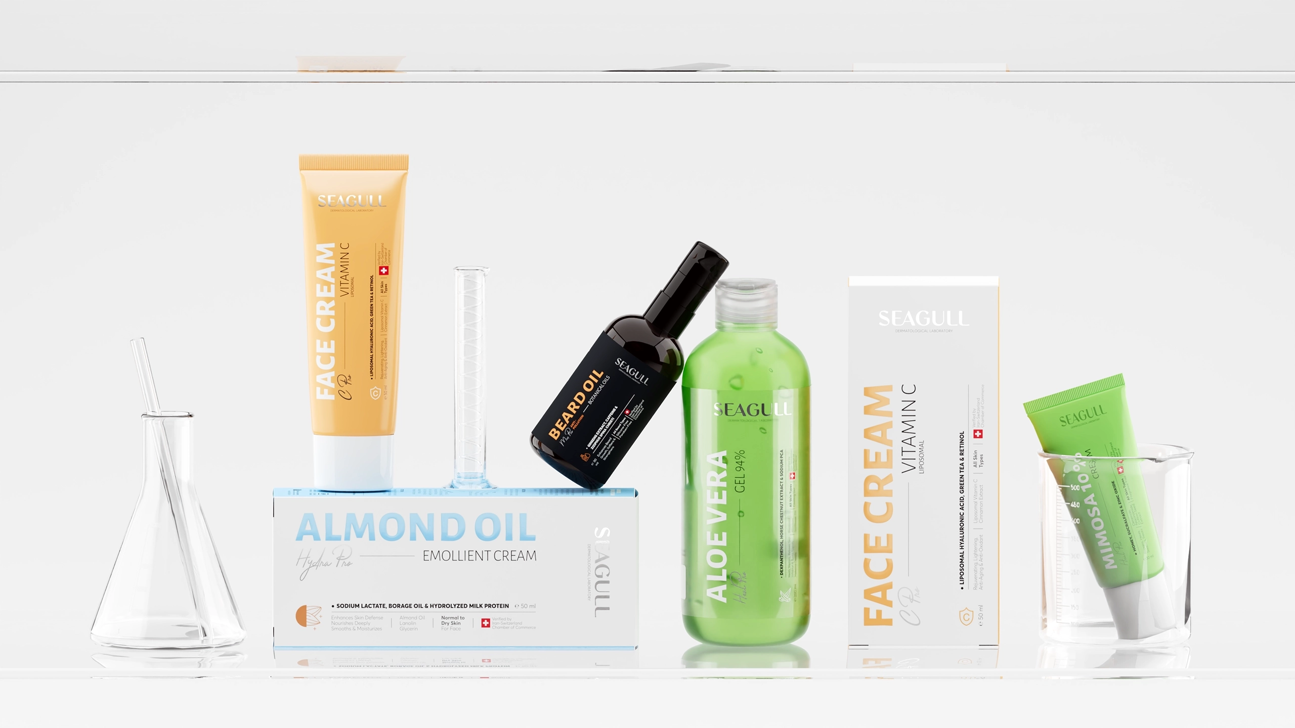
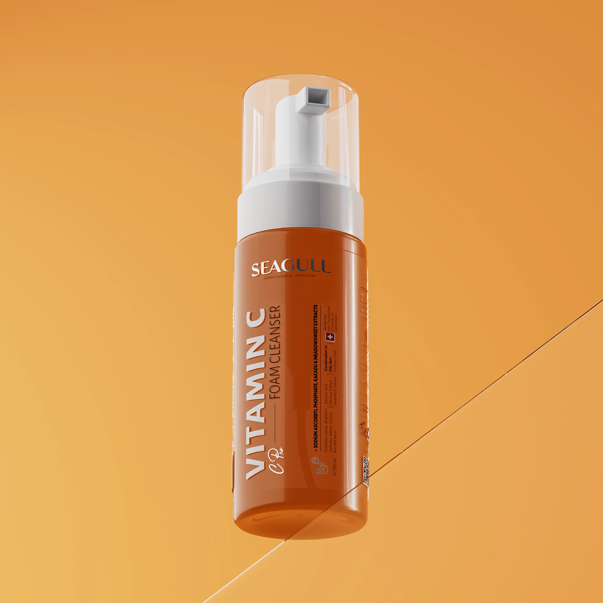
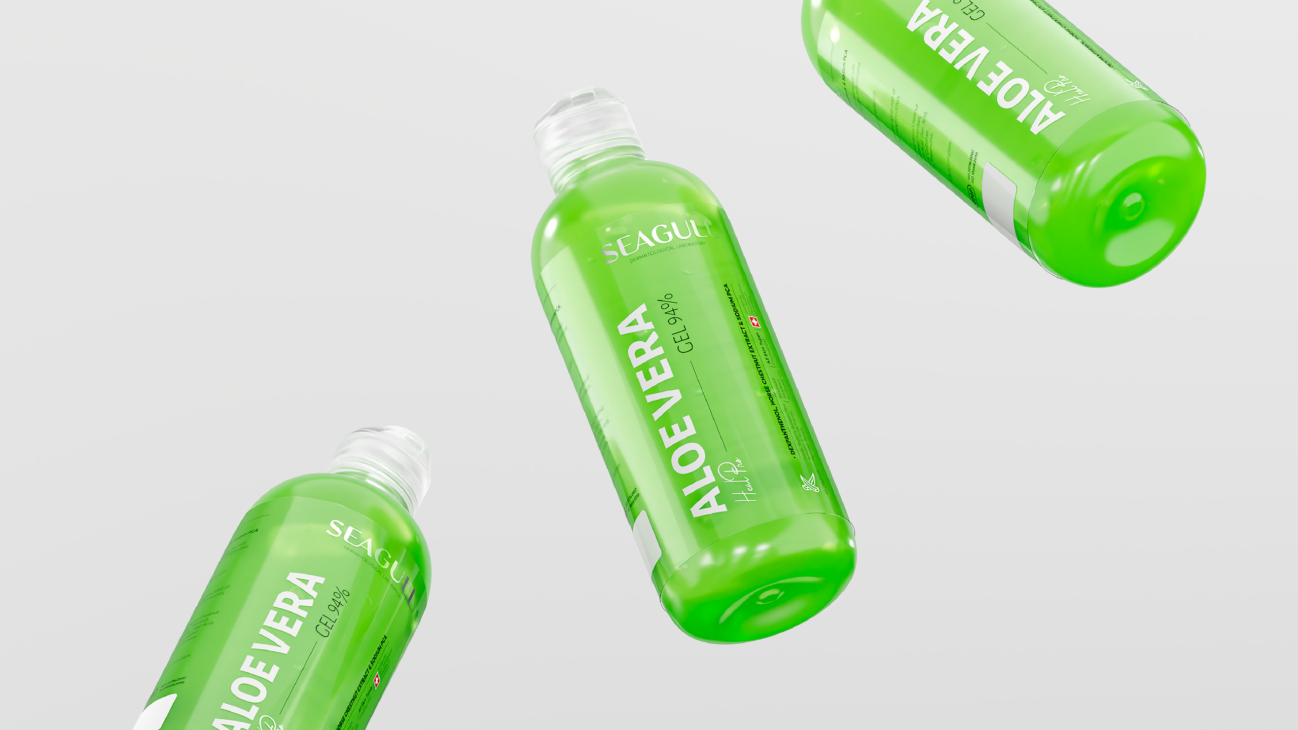
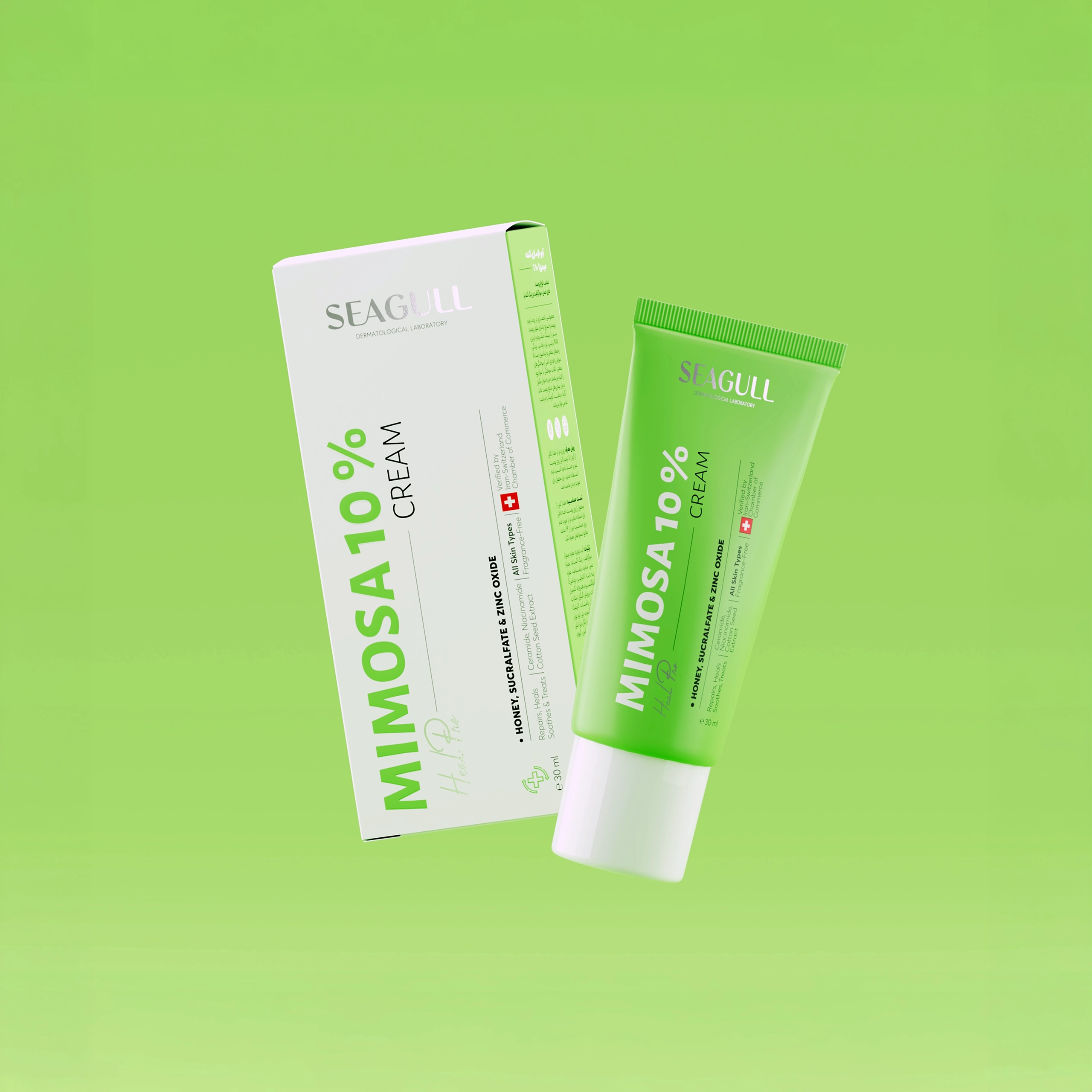
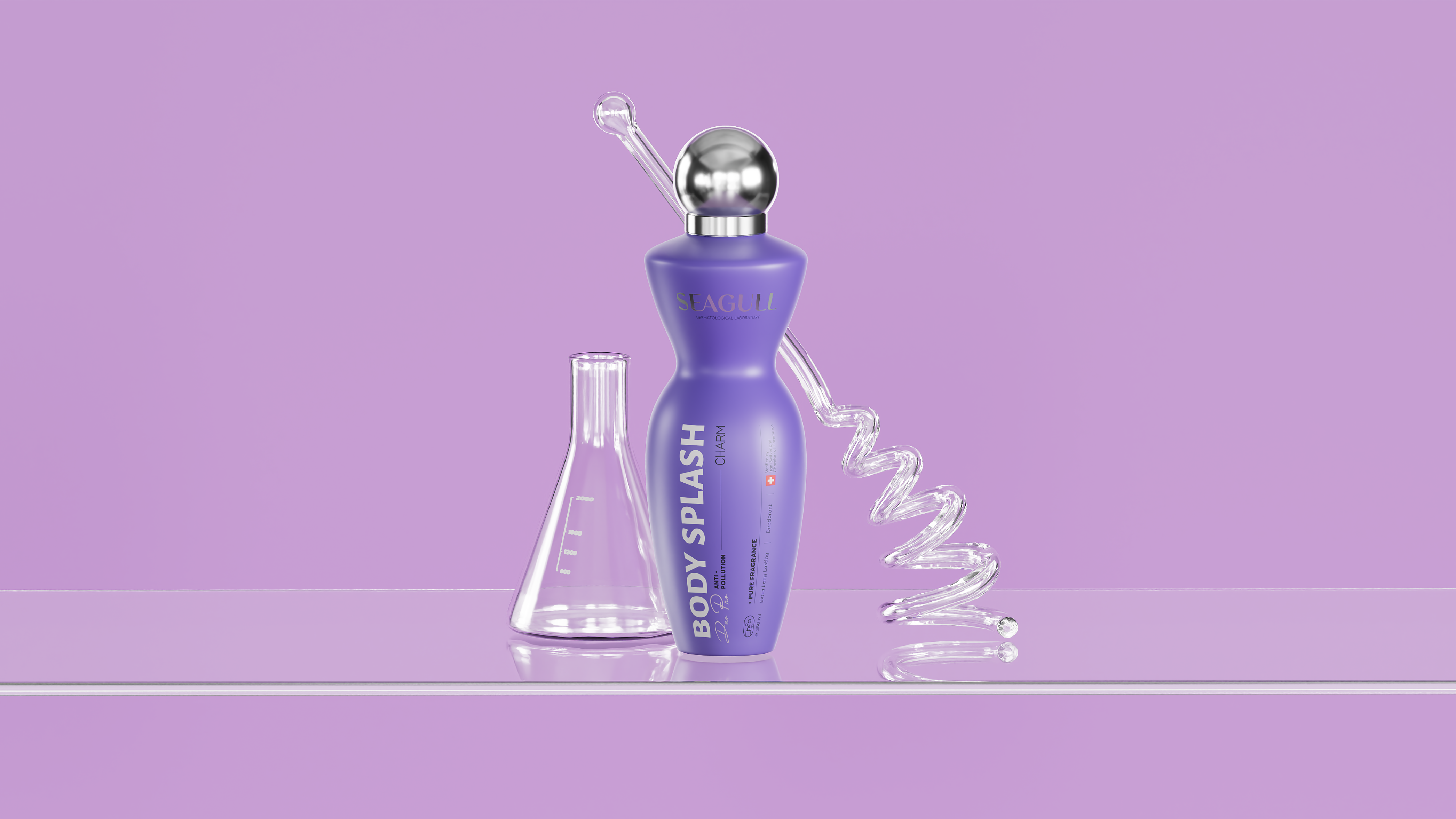
Our process for Seagull skincare packaging design began with an in-depth study of the brand’s laboratory origins and pharmaceutical heritage. Built on research, product efficacy, and clinical credibility, these foundations shaped a refreshed skincare brand identity based on clarity, discipline, and dermatological precision. The redesigned packaging system introduced a calibrated typographic structure, refined spacing logic, and a clear hierarchy of information to improve readability, usability, and consumer navigation across the full Seagull skincare product portfolio.
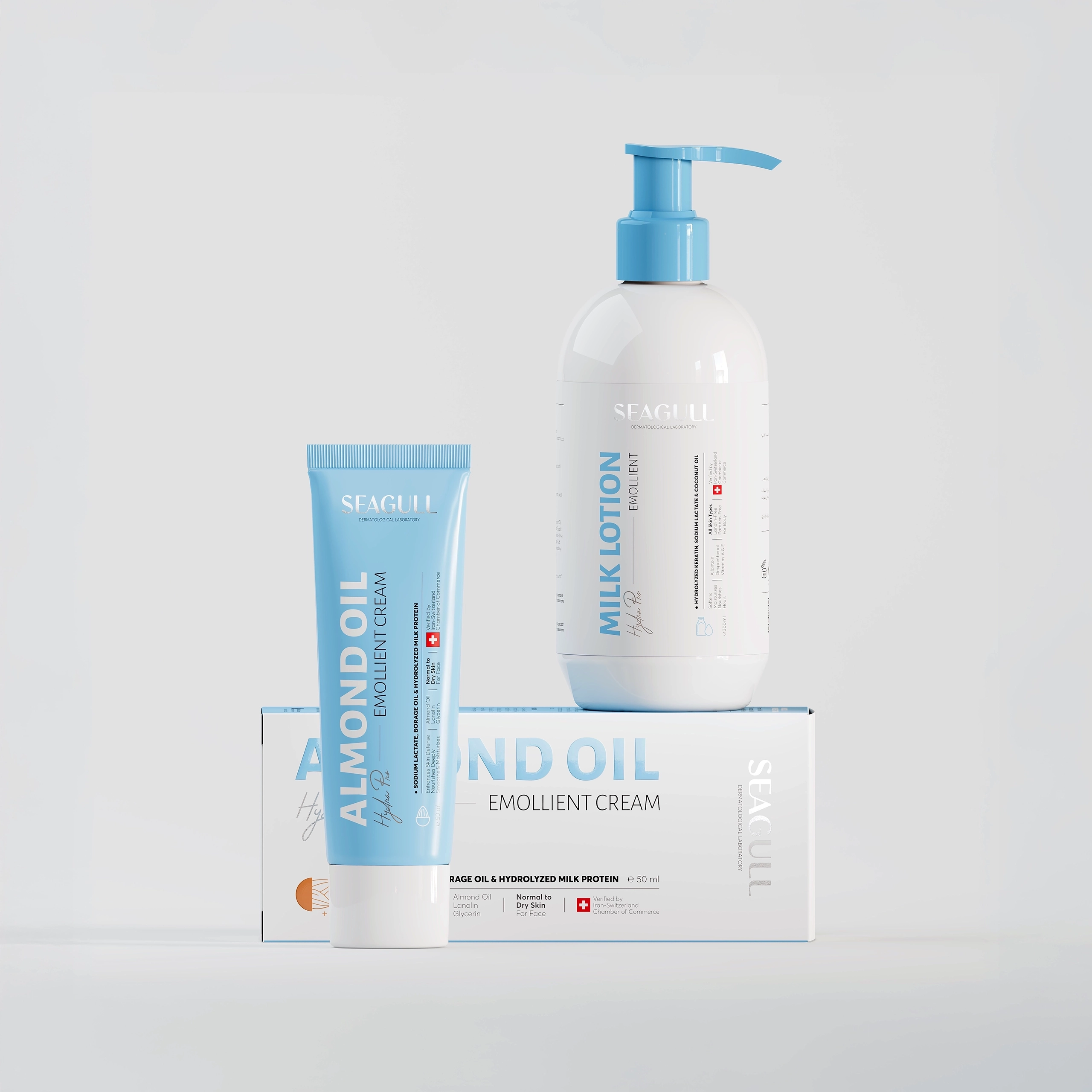
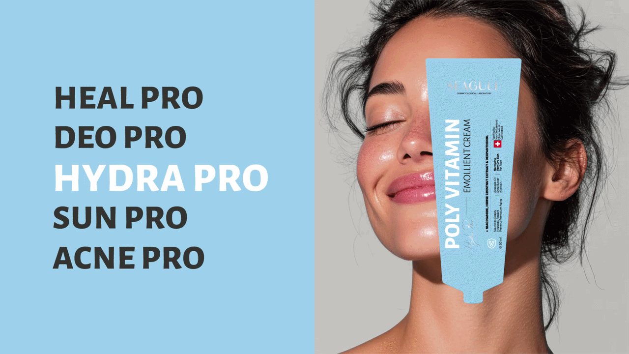
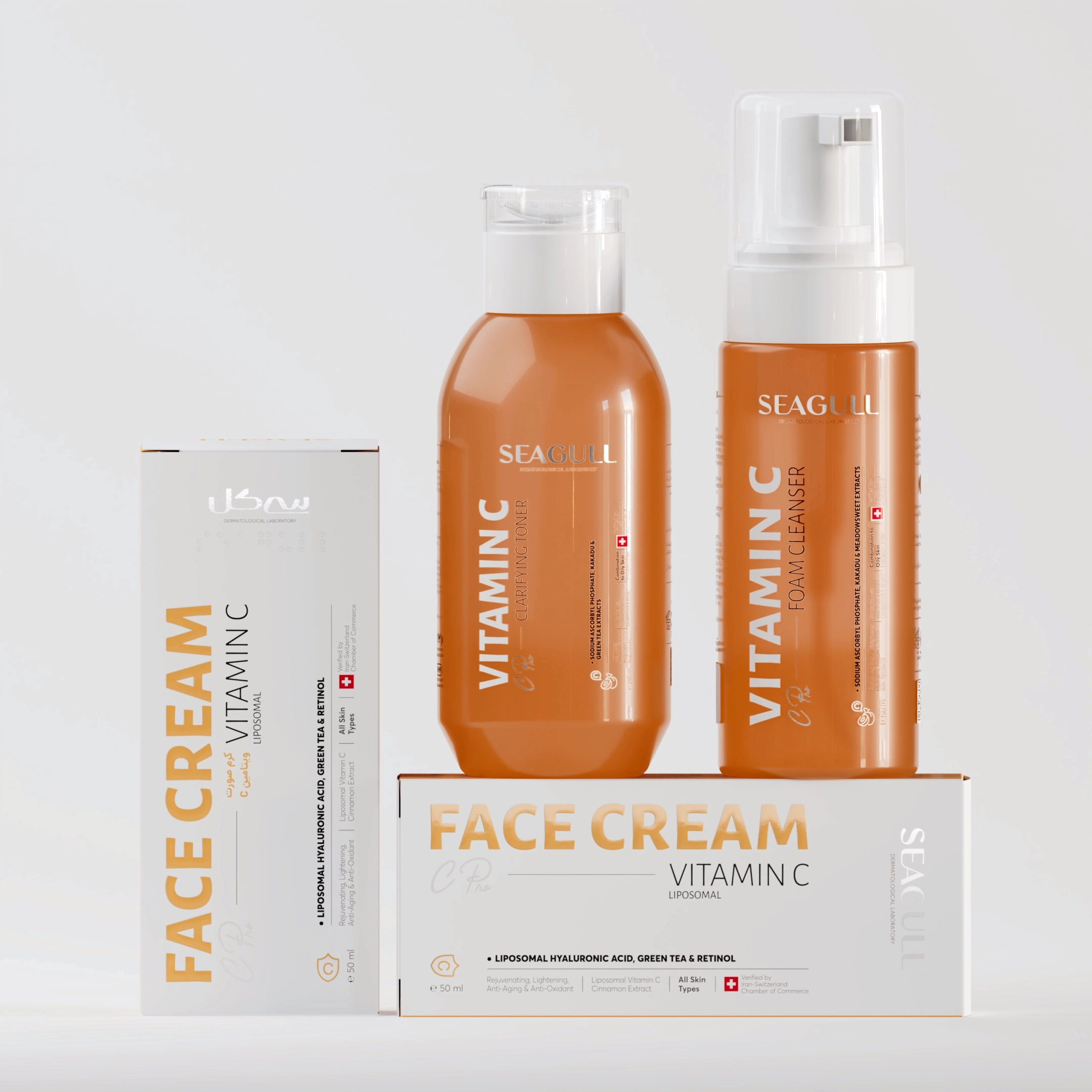
A key part of the Seagull skincare packaging redesign was the introduction of a purposeful colour-coded categorisation system. This framework created clearer differentiation between product families, improved shelf navigation, and helped customers understand the range more intuitively. While essential heritage elements were carefully preserved to maintain familiarity and trust among long-term consumers, every visual component was modernised to meet contemporary scientific skincare standards and create a more cohesive, clinical, and future-ready brand experience.
A major component of the redesign was the introduction of a purposeful colour-coded categorisation framework, enabling clearer differentiation between product families and significantly improving shelf navigation. This not only enhanced functional usability but also elevated the overall aesthetic harmony of the brand. While essential heritage elements were carefully preserved to maintain familiarity and loyalty among long-term consumers, each visual component was thoughtfully modernised to meet contemporary scientific skincare standards.
A Future-Ready
Skincare Brand
Identity
DIELINE AWARDS WINNER 2021
THIRD PLACE
Presented by Adobe
Through this Seagull skincare packaging design and brand identity transformation, DEEEZ created a cohesive, clinical, and modern visual system for the brand. The redesign strengthened Seagull’s position in the dermatological skincare market by improving packaging clarity, product hierarchy, and shelf navigation.
A colour-coded categorisation system was introduced to help differentiate product families and create a more intuitive consumer experience, while preserving key heritage elements to maintain brand familiarity and trust.
Designed by Deeez.co Creative Director: Yekta Jebelli Art Director: Mostafa S. Ebrahimi Graphic Designers: Saba Emami, Erfan Hakani, Faezeh Seidi, Negin Samimi, Mona Safavi Design Development: Negin Samimi, Saba Emami, Mehdi Ahangar Logo Redesign: Erfan Hakani 3D Artist: Sepehr Khoshnazar Motion Designer: Ghazal Chavoshi